Lens gives you full control over how you visualize your revenue data. It comes with a ready-made overview of your catalog performance and lets you build custom dashboards using over 25 chart templates, interactive filters, and cross-dimensional analysis.
Lens currently supports up to 3 dashboards: 2 shared across all users on your account and 1 personal dashboard for each user.
Availability: Indie plans and above.
Getting Started
To access Lens, click Lens within the Insights menu. You will land on the Overview tab, which displays the default Catalog Overview dashboard.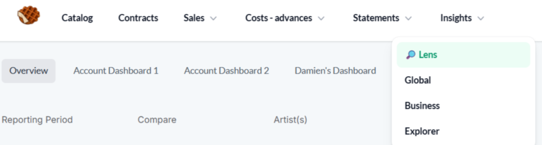
The Overview Dashboard
The Overview dashboard is a pre-built, read-only dashboard designed to answer the most common questions about your catalog performance. It includes the following components:
.png)
Headline metrics (Row 1) Four KPI cards showing your total revenue, streaming units, download units, and physical units for the selected period. Each card includes a comparison to the previous period.
Revenue rankings (Row 2) Two horizontal bar charts showing your Top 10 Artists by Revenue and Top 10 Retailers by Revenue. These give you an immediate picture of who and which platforms are driving your income.
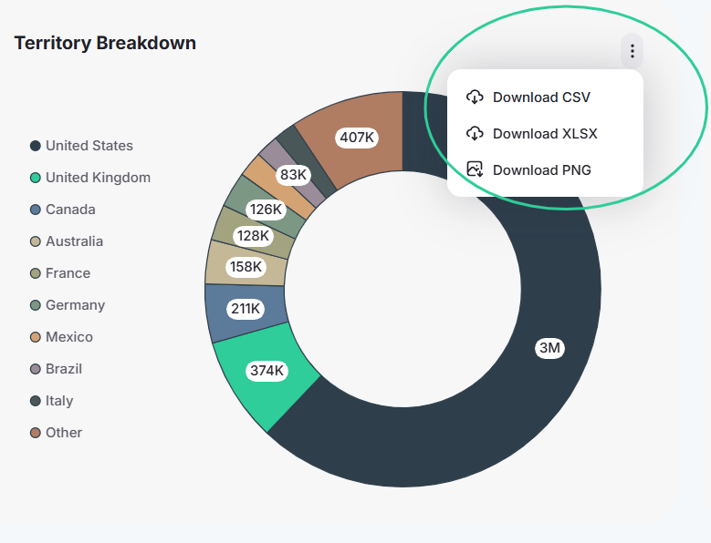
Geographic and Sales Channel (Row 3) A donut chart showing your Top 10 Territories by revenue share, and a Top 10 Sales channels by Revenue.
Release performance (Row 4) A table highlighting your recent release performance with columns for title, artist, net revenue, and units.
Filtering
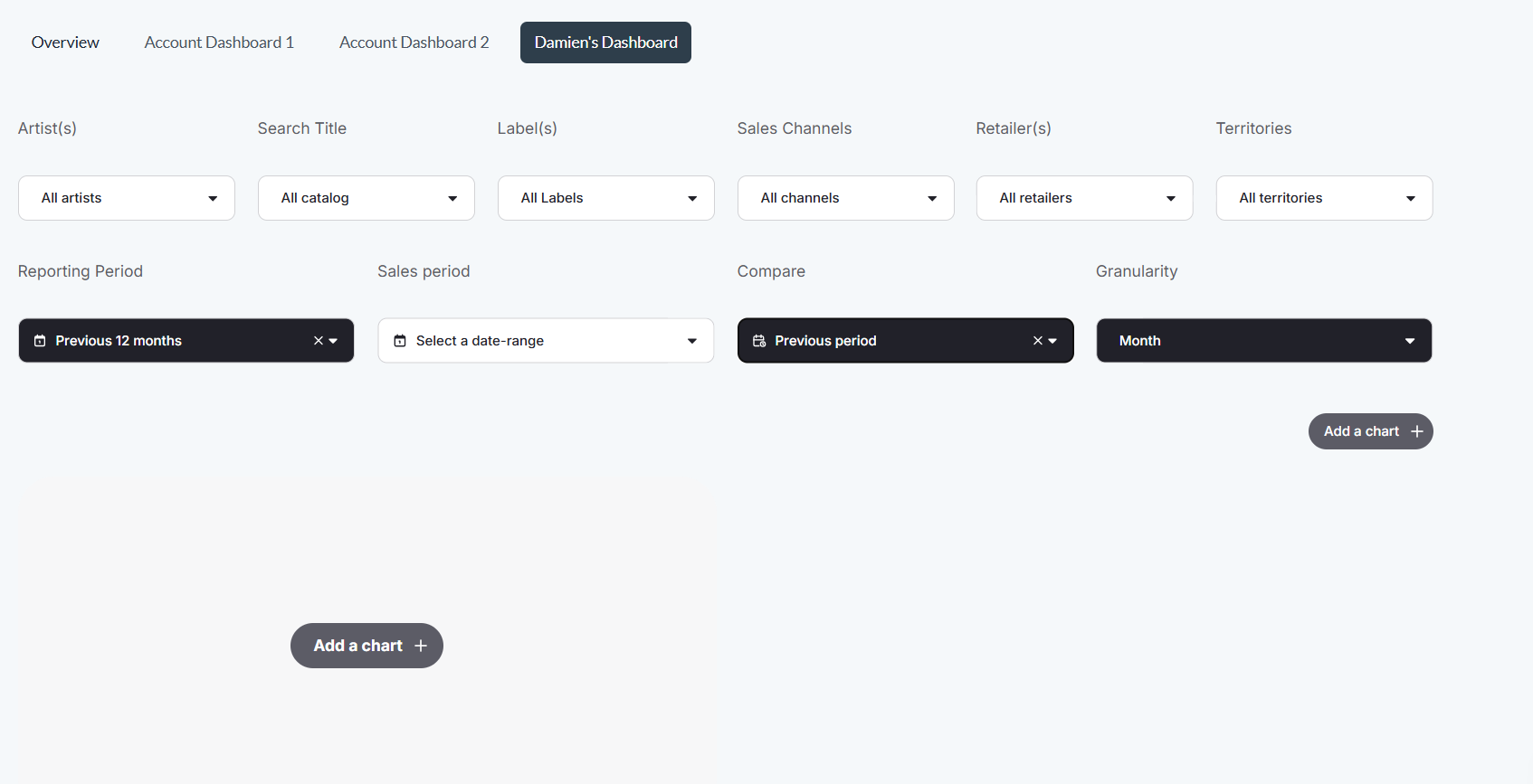
All components on the Overview dashboard respond to the global filter bar at the top of the page. You can filter by artist, label, territory, reporting period, sales channel, and retailer.
When you apply a filter, every chart and KPI on the dashboard updates automatically.
Example: Select "Spotify" in the retailer filter to isolate Spotify revenue across all components. Clear it, then filter by country to see your territorial performance.
Custom Dashboards
Beyond the Overview, Lens lets you build your own dashboards:
Account dashboards (up to 2) shared across all users in your account.
Personal dashboard (1 per user) visible only to you. This tab displays your first name (e.g., "Damien's dashboard").
Creating Your First Custom Dashboard
Navigate to a custom dashboard tab. Click on an Account Dashboard tab or your personal dashboard tab.
Add a component. Click the Add a Chart button. This opens the template library.
Choose a template. You have two options:
Pre-built templates load with data immediately. They are ready-made visualizations like "Top 10 Territories" or "Sales Channel Breakdown" that require very little configuration.
Custom templates (marked with [Custom]) let you configure the chart yourself by selecting dimensions, measures. See the Template Library article for full list.
Repeat. Add as many components as you need to tell the story that matters to your catalog,n then click Done to save your dashboard.
Interacting with Components
Each component on a custom dashboard supports interactivity:
Hover over data points, bars, or cells to see tooltips with exact values.
Click on relevant chart elements to apply filters across all components on the dashboard, just like the global filters on the Overview.
Date ranges can be set using built-in options including Last 12 Months and Previous Period, with support for both reporting period and sales period.
Exporting Your Data
Each component on your dashboard can be exported individually as a CSV, XLSX, or image file. Click the export option on any chart or table to download its data.
Because you can build custom tables with your own dimensions and filters, Lens also works as a flexible data exploration tool. Configure a table with the exact breakdown you need, apply your filters, and export the result directly without having to work with raw sales files.