The Lens template library includes over 25 templates you can add to your custom dashboards. Templates are organized into two categories: generic building blocks you configure yourself, and pre-built insights that load with your data immediately.
To access the template library, open any custom dashboard tab and click Add a Chart..png)
Understanding Measures and Dimensions
Every chart in Lens is built from two concepts: measures and dimensions.
A measure is the number you want to display. This is typically a financial or quantity value like net received revenue, gross revenue, or units sold. Measures answer the question "how much?"
A dimension is the category you want to group that number by. This could be an artist, a retailer, a territory, a sales channel, or a time period. Dimensions answer the question "broken down by what?"
For example, a horizontal bar chart showing your Top 10 Artists by Revenue uses "Net Received" as the measure and "Artist" as the dimension. A heatmap showing Artist x Retailer Performance uses "Net Received" as the measure with two dimensions: "Artist" and "Retailer."
When you add a [Custom] template, you select the measure(s) and dimension(s) yourself. Pre-built templates come with these already configured.
Customizing Components
How much you can customize depends on the template type.
[Custom] templates give you full control. You choose the measure, dimension(s), chart type, and all display options (title, description, number formatting, max values, colors, etc.).
Pre-built templates come with a pre-configured measure and dimension, but you can still adjust some parameters: the chart title, description, and the maximum number of values displayed. Depending on the template, you may also be able to change the measure (e.g., switch from net revenue to units)..png)
Abbreviate large numbers
When working with revenue figures or units, open the More options menu on any measure and enable Abbreviate large number. This formats values as 1.2M or 350K instead of raw numbers, making charts much easier to read at a glance. This setting is not enabled by default but is recommended for most components.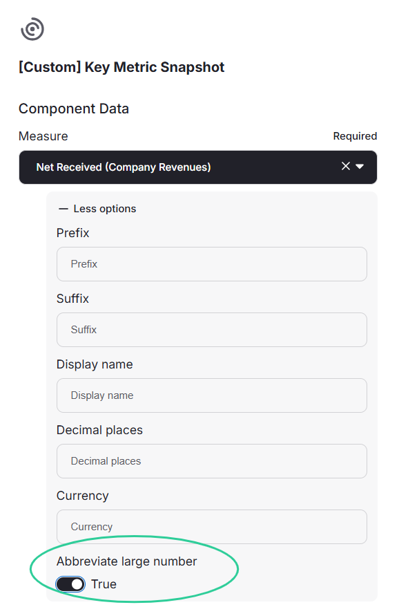
Generic Building Blocks [Custom]
These are fully configurable chart types. When you select one, you choose your own dimensions, measures, and filters to build a chart from scratch.
Template | Chart type | Use it for |
|---|---|---|
Key Metric Snapshot | KPI with comparison | Displaying a single headline figure with period-over-period change |
Category Comparison (Horizontal) | Stacked bar | Ranking or comparing values across categories side by side |
Category Comparison (Stacked) | Stacked bar | Comparing totals and their composition broken down by a second dimension |
Bar Chart - Grouped | Grouped bar | Comparing multiple data sets side by side across categories |
Proportion Breakdown | Donut | Comparing shares of revenue, units, or any metric across categories |
Trend Comparison | Line chart | Tracking how one or more values evolve over time |
Data Table | Paginated table | Browsing exact figures in a sortable, scrollable view |
Pivot Table | Cross-reference grid | Breaking down two dimensions against each other (e.g., retailer vs. territory) |
Heat Map | Heatmap | Spotting patterns and concentration across two dimensions using color intensity |
Pre-Built Insight Templates
These templates are ready to use. Select one, and it renders with your data immediately.
Revenue overview
Template | What it shows |
|---|---|
Total Revenue Overview | Net Revenue with built-in filtering and period comparison |
Average Revenue per Retailer | Average revenue across retailers to identify which platforms perform best for your catalog |
Gross vs. Net by Source & Year | Gross and net revenue across sources year over year to track how deductions and margins evolve |
Rankings
Template | What it shows |
|---|---|
Top 10 Artists by Revenue | Highest-earning artists, filterable by period, label, or territory |
Top 10 Labels by Revenue | Performance comparison across labels (for multi-label catalogs) |
Top 10 Best Sellers | Top releases or tracks by units sold |
Top 10 Territories | Which countries generate the most revenue |
Top New Releases | Releases from the last 12 months ranked by net revenue for the selected period and filters |
Trends over time
Template | What it shows |
|---|---|
Revenue by sales period & Label | Revenue broken down by sales period and label (stacked vertical bars) |
Channel Mix Over Time | How your channel distribution evolves period over period |
Territory Mix Over Time | How your geographic revenue distribution shifts over time, to spot growing or declining markets |
Channel and geographic analysis
Template | What it shows |
|---|---|
Sales Channel Breakdown | Revenue split between streaming, downloads, physical, and other channels |
Artist x Retailer Performance | Which retailers drive revenue for each artist, with color intensity showing strong and weak combinations |
Retailer x Territory Heatmap | Which retailers dominate which territories, to spot concentration patterns and geographic gaps |
Revenue by Territory & Retailer | Top revenue combinations of territory and retailer, to identify your strongest market-platform pairs |
Detailed tables
Template | What is shows |
|---|---|
Units by Retailer & Month | Unit quantities per retailer across months, useful for spotting retailer-specific trends |
Units by Retailer & Channel | Unit quantities broken down by retailer and sales channel |
Tips for Building Dashboards
Start with 2 or 3 pre-built templates to get a quick view of your data. You can always add custom templates later for more specific analysis.
Mix chart types to cover different angles. For example, combine a donut chart for territorial share, a horizontal bar for channel breakdown, and a heatmap for artist-by-retailer patterns. Each type reveals something different.
For guidance on choosing the right chart type for your data, see the Data Tips article.